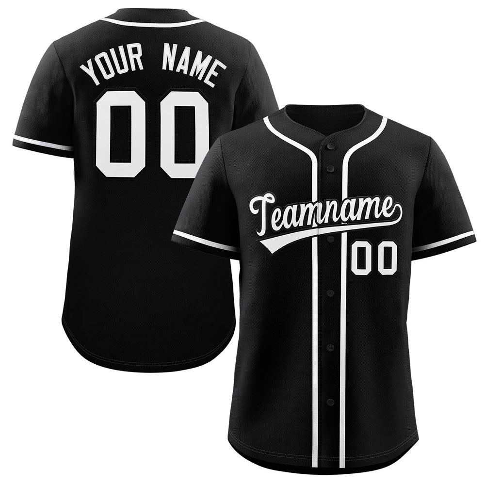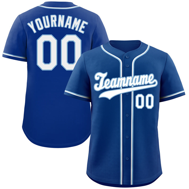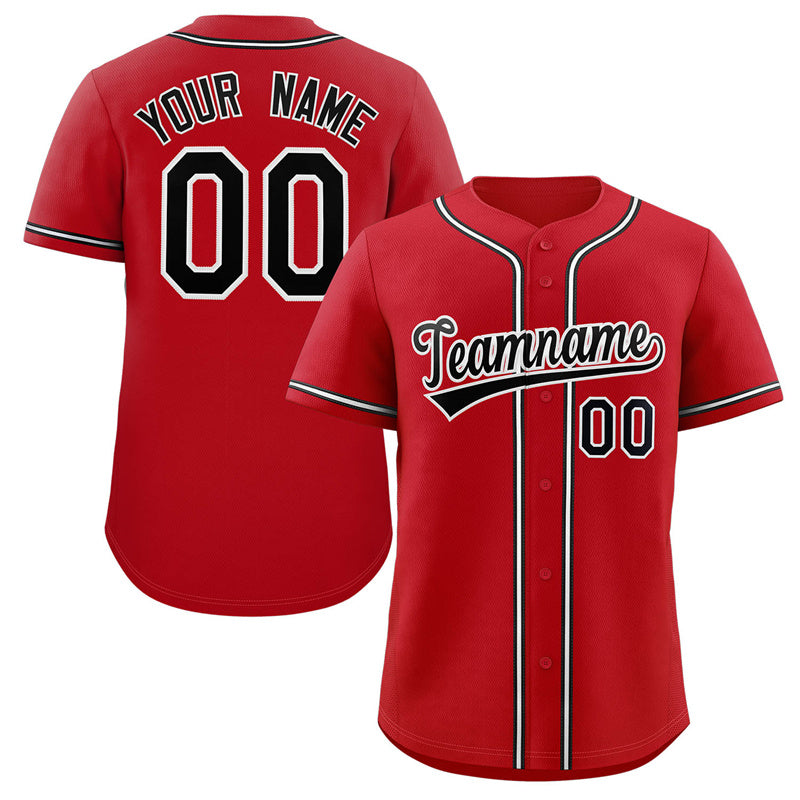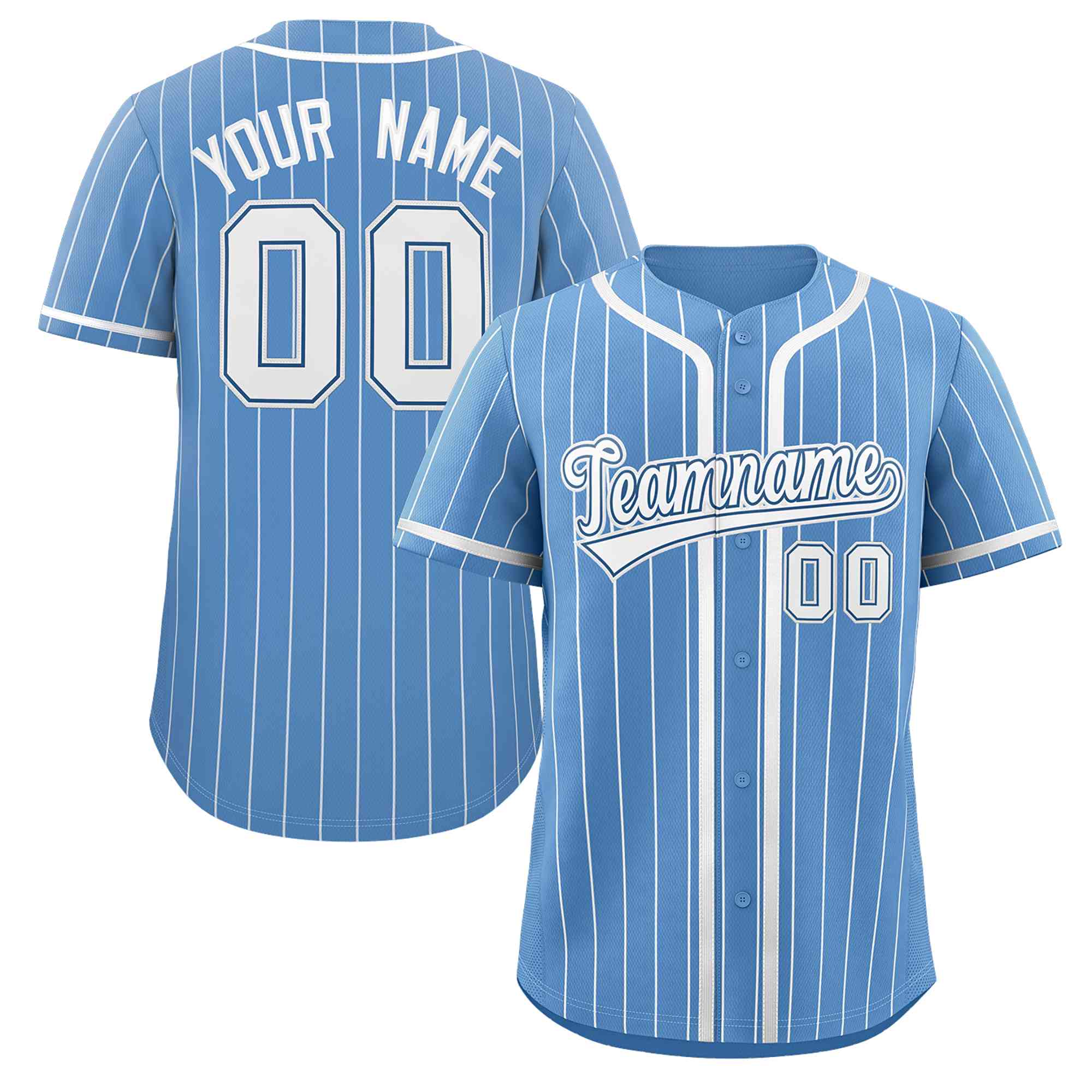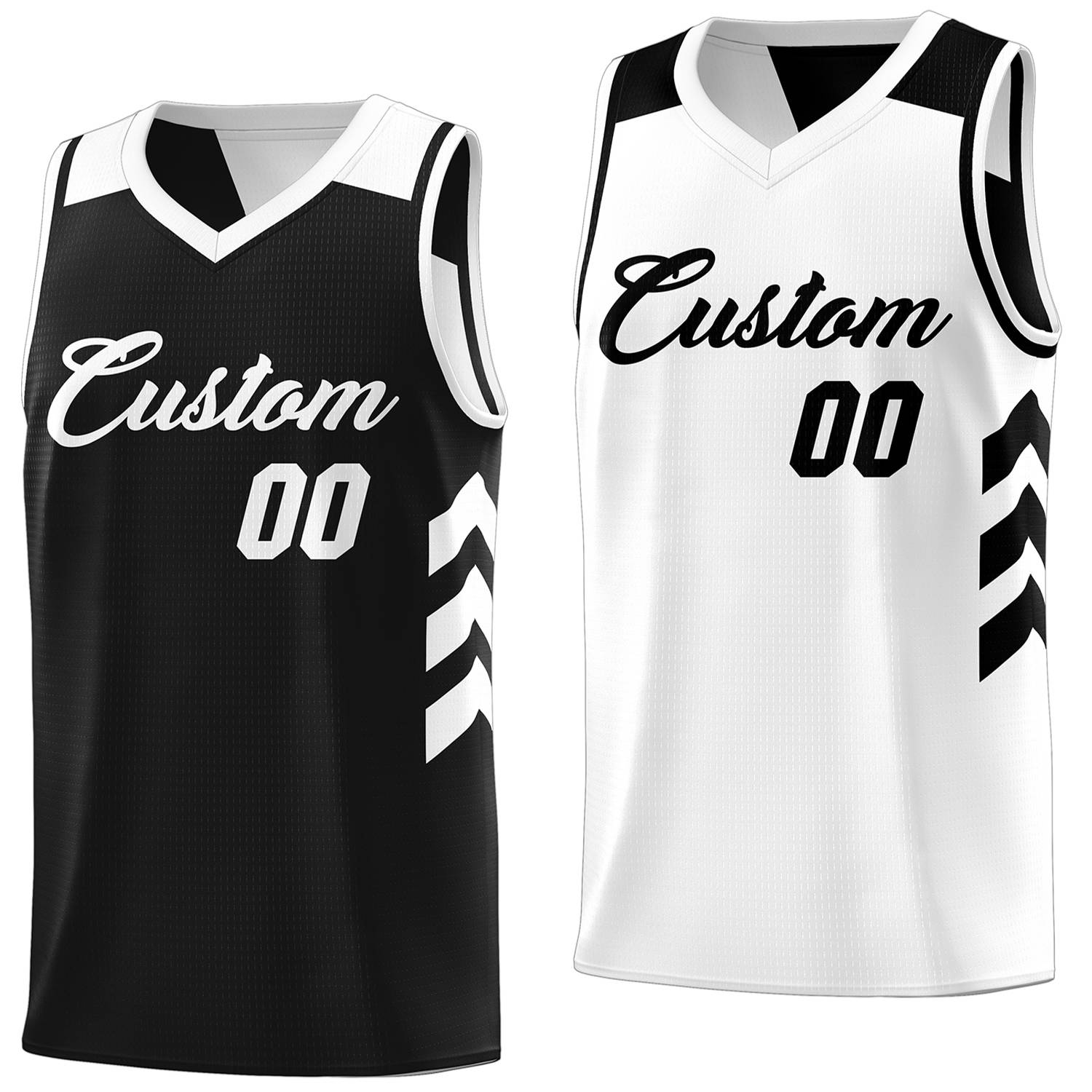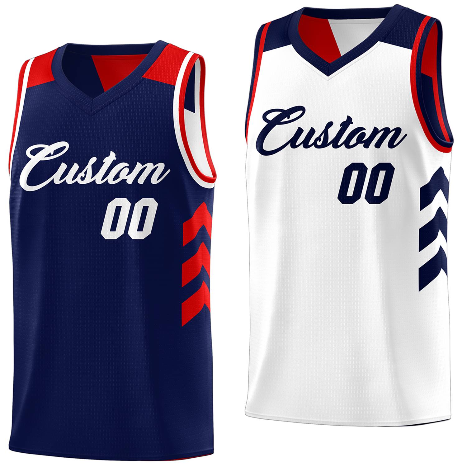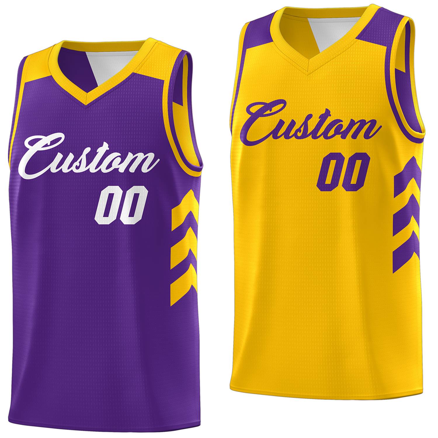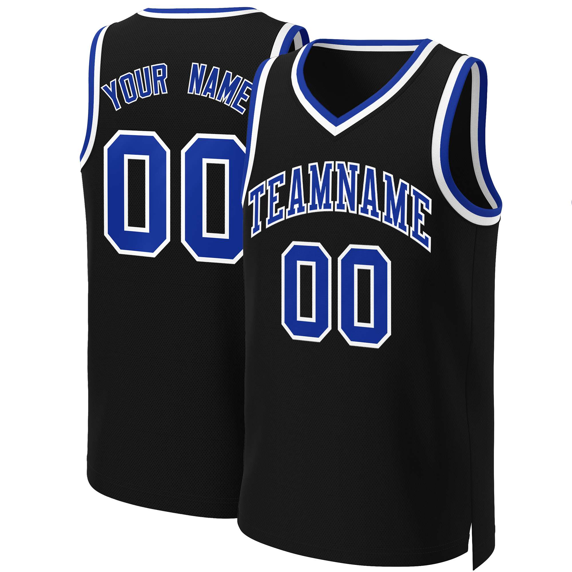

How to Design Your Logo: 7 Logo Types Explained (and Which One Actually Works on Custom Jerseys)
July 06, 2026 7 min read


Most teams don't realize this until it’s too late:
A logo that looks great on a screen can fail completely on a jersey.
On custom sports apparel — especially jerseys for baseball, basketball, football, school teams, or clubs — your logo isn't just decoration. It directly affects:
-
How professional your team looks
-
How readable are your uniforms on the field
-
How clean your printing or embroidery turns out
-
How expensive your production becomes
A jersey logo must be designed for printing first, not for digital display.
This guide breaks down the 7 most common logo types and, more importantly, shows you which ones actually work on custom jerseys — and which ones quietly cause printing problems.
What Makes a Logo Work on Custom Jerseys (Before You Design Anything)
Before choosing a logo style, you need to understand one thing:
A good logo for jerseys is not the most creative one — it's the most reproducible one.
That means it must survive:
-
small chest placement
-
large back printing
-
embroidery stitching
-
sublimation printing on polyester fabric
-
screen printing limitations
A jersey-ready logo must do 4 things well:
1. Be readable from distance
Players move. Fans watch from far away. Referees see you in motion. If your logo loses clarity at 10–20 meters, it fails its job.
2. Stay clear at small size
A logo on the chest or sleeve is often very small. If your design depends on thin lines or tiny details, it will disappear.
3. Work across printing methods
Different decoration methods change how your logo behaves:
-
Sublimation → good for color, bad for micro details
-
Screen printing → limited colors, clean shapes only
-
Embroidery → requires bold structure, not complexity
4. Stay consistent across all apparel
Your logo will appear on jerseys, hoodies, hats, jackets, and bags. A good logo must scale across all of them without redesign.
The 7 Logo Types (and What Actually Works on Jerseys)
1. Wordmark Logo (Full Team Name Text)
What it is: Text-only logo featuring your full team or school name.
Works best for: School teams, short team names, clean traditional uniforms.
Why teams choose it: Wordmarks are the most readable logo type. No confusion, no symbols — just the name.
Works well when: Your team name is short (under ~10 characters) and you want a professional, classic look.
Jersey insight: Wordmarks are safe and readable, but rarely memorable on their own. Best paired with a secondary mark for hats and merch.
2. Lettermark Logo (Initial-Based Logo)
What it is: One or a few initials used as the primary logo mark.
Works best for: Schools, universities, competitive club teams.
Why it works: Lettermarks are compact and highly scalable.
Strong advantages:
-
Fits small chest areas perfectly
-
Works well in embroidery
-
Looks clean and athletic
Jersey insight: This is one of the safest choices for apparel printing. It‘s practically fail-proof across all decoration methods.
3. Monogram Logo (Stylized Initial Art)
What it is: Interwoven or artistic initials forming a decorative symbol.
Works best for: Vintage baseball teams, varsity jackets, retro school identity.
Strength: Premium, traditional aesthetic with strong embroidery compatibility.
Jersey insight: Monograms are style-heavy — but they only work if simplified for printing. Keep the interlocking clean and the outlines thick.
4. Mascot Logo (Character-Based Design)
What it is: An illustrated character like a tiger, eagle, wolf, or other team symbol.
Works best for: Youth sports teams, school athletics, community leagues.
Strength: Builds strong emotional identity and team spirit instantly.
Jersey insight: Mascots must be simplified to survive production. Use bold shapes, limit detail, and always test a small version before committing.
5. Emblem Logo (Badge / Seal Style)
What it is: A logo inside a shape like a badge, shield, or circle.
Works best for: Football teams, baseball teams, schools, traditional clubs.
Strength: Looks official and structured — perfect for patches and embroidery.
Jersey insight: One of the most “uniform-friendly” logo types. The border helps define the shape clearly, making it easier to print and embroider.
6. Abstract Logo (Modern Symbol Design)
What it is: Geometric or symbolic shapes without literal representation.
Works best for: Esports teams, modern athletic brands, creative clubs.
Strength: Unique identity that stands out from traditional sports logos.
Jersey insight: Best for modern branding, not classic school sports identity. Works great on sublimation but can be tricky for embroidery.
7. Combination Mark Logo (Icon + Text)
What it is: A mix of graphic symbol and team name or initials.
Works best for: Almost all teams — the most versatile option.
Why it's powerful: You can split it — icon for hats, text for jerseys, full version for marketing.
Jersey insight: The most production-ready option for real teams. Maximum flexibility across all apparel types and print methods.
How to Choose the Right Logo for Your Jersey (Simple Decision Guide)
If your team is a SCHOOL or varsity program:
→ Choose: Emblem or Wordmark
Why: Traditional identity, readable across all sports, works long-term without looking dated.
If your team is a SPORTS CLUB or competitive team:
→ Choose: Lettermark or Combination Mark
Why: Clean visibility, scalable branding, works on multiple products from jerseys to hoodies.
If your team is YOUTH or community-based:
→ Choose: Mascot (simplified version)
Why: Emotional identity matters more than branding rules for younger players and families.
If your team is MODERN BRAND or esports:
→ Choose: Abstract or Combination Mark
Why: Flexible across digital platforms and apparel, it looks current and distinctive.
4. Common Logo Mistakes That Break Jerseys (Most Teams Don't Expect This)
These are the real reasons jerseys look “cheap”:
1. Over-detailed logos
Small details disappear instantly on fabric. If it can’t be drawn from memory, it's too complex.
2. Too many colors
More colors = harder printing + higher costs. 2–4 colors are the safe range for most jerseys.
3. Low-resolution artwork
Screenshots and social media images are not print files. You need vector files (SVG, PDF, AI) or high-res PNGs at 300 DPI minimum.
4. Ignoring jersey placement
One logo cannot fit all positions. Chest ≠ back ≠ sleeve ≠ hat. Design with each placement in mind.
5. Poor contrast
If your logo blends into the jersey color, it becomes invisible on the field. Visibility matters more than design beauty in sports apparel.
6. Not testing before production
Many teams approve a digital mockup without seeing how the logo behaves at actual print size. Always request a scaled test or printed sample.
5. Pro Tips for Designing a Jersey-Ready Logo
-
Design for distance first, detail second
-
Test your logo on both dark and light jerseys
-
Keep the embroidery version simpler than the digital version
-
Avoid thin lines and micro text at all costs
-
Always create a “small version” of your logo for hats and sleeves
-
Use high-contrast colors that read well under stadium lighting
-
Consider a monochrome version for single-color printing needs
A good jersey logo is not just designed — it is tested for failure.
6. Logo File Preparation (Critical for Printing Quality)
Best formats:
| Format | Best for |
|---|---|
| SVG | Best overall — scales infinitely |
| PDF (vector) | Industry standard for printing |
| AI / EPS | Professional design source files |
| PNG (high-res, transparent) | Preview and some digital uses |
Minimum quality requirements:
-
300 DPI at actual print size
-
Clean edges with no pixelation
-
No compression artifacts
-
Transparent background (not white)
Never use:
-
Phone screenshots
-
JPGs from websites
-
Social media downloads
-
Blurry resized images
-
Low-res images pulled from Google
If your file is bad, your jersey will be bad — no exception. We can‘t fix a blurry image after production starts.
7. From Logo to Jersey: How the Process Actually Works
-
Share your team name, sport, and style direction — tell us what you're going for
-
Choose logo type based on jersey use — we'll help you pick the right style for your needs
-
Get a mockup on an actual jersey layout — see your logo on a uniform before you commit
-
Adjust size, color, and placement — fine-tune everything for maximum impact
-
Approve final print file — we handle the technical prep work
-
Start production — get your game-ready uniforms delivered on time
The key step most teams miss is step 3 — testing on a real jersey layout. Don't skip it.
FAQ
What logo type works best for custom jerseys?
Mascot, emblem, lettermark, and combination logos work best because they are readable and scalable across different jersey placements and printing methods. For most teams, a combination mark offers the best balance of flexibility and production reliability.
What file format should I send for jersey printing?
Vector files (SVG, AI, PDF) are best. They ensure sharp printing at any size and work for embroidery, sublimation, and screen printing. If you only have a PNG, make sure it's at least 300 DPI with a transparent background — but vector is always preferred.
Can I use a complex logo for jerseys?
You can, but it usually needs simplification. Complex logos often lose detail in embroidery and small chest prints. We can help simplify your design while keeping its core identity intact. Many teams don't realize this until they see their first production sample — don't let that be you.
How many colors should a jersey logo have?
Most jersey logos work best with 2–4 colors for clarity, cost efficiency, and print consistency. If you're using sublimation, you can use more colors without extra cost, but keep in mind that too many colors can still look busy and reduce readability from a distance.
What if I don't have a print-ready logo file?
We can help. Many teams are in this situation. We offer free artwork review and can often recreate or trace simple logos into vector format. If your logo needs redesign, we'll guide you through the process — no pressure, no hidden fees.
How long does the custom jersey process take?
From logo approval to delivery, typically 2–4 weeks depending on order size and decoration method. The design and mockup phase usually takes just 1–3 business days — the longest part is making sure your logo is print-ready.
Ready to Design Your Team's Jerseys?
Don't wait until you're stuck with a logo that doesn't print well.
Whether you have a design ready or need help from scratch, we'll make sure your logo looks incredible on every jersey, hoodie, and hat your team wears.
[Contact us for a free design consultation] – we'll review your logo, suggest the best style for your sport, and send you a mockup before you commit.
Get it right the first time. Your team deserves that.
Leave a comment
Comments will be approved before showing up.
Also in News
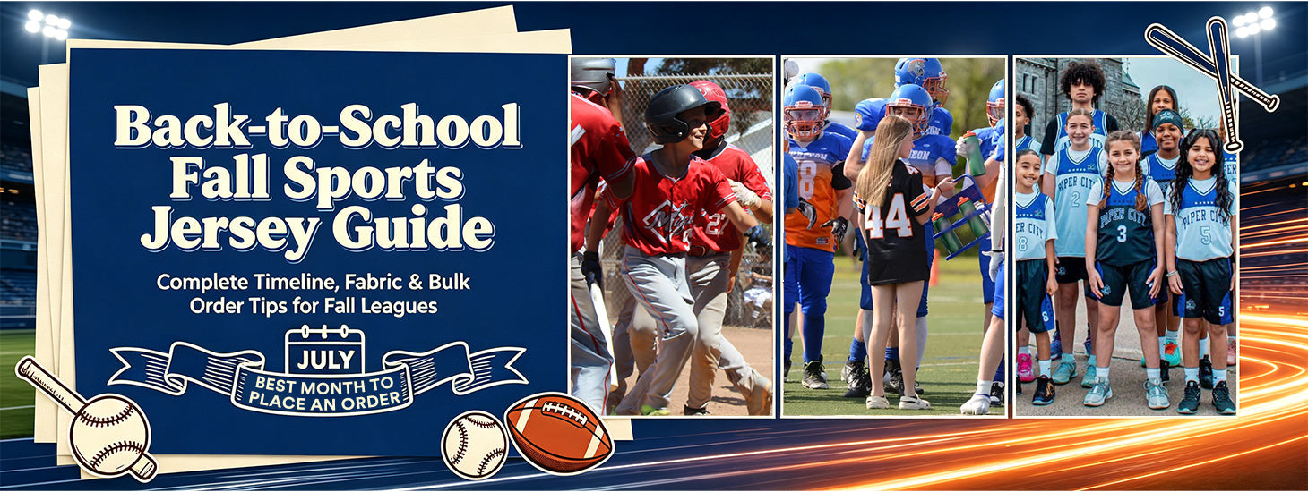

Back-to-School Sports Guide: How to Prepare Your Team with Custom Jerseys Before the Fall Season
July 13, 2026 5 min read
Plan ahead for the fall sports season with KXK's complete jersey ordering guide. Discover why July is the best time to order, what features matter most in a team jersey, and how to get custom football jerseys, baseball uniforms, and warm-up hoodies with zero hassle. Free custom design, no MOQ, and factory-direct pricing—get your team game-ready today.
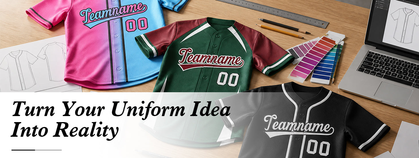

From Concept to Custom Jersey: How Designers Turn Your Vision Into Reality
June 26, 2026 3 min read
Creating a custom jersey starts with an idea. This guide explains the design process step by step, from choosing the right sport template and decoration method to adding logos, names, and numbers. Discover how professional designers help transform your concept into a complete custom jersey mockup ready for production.
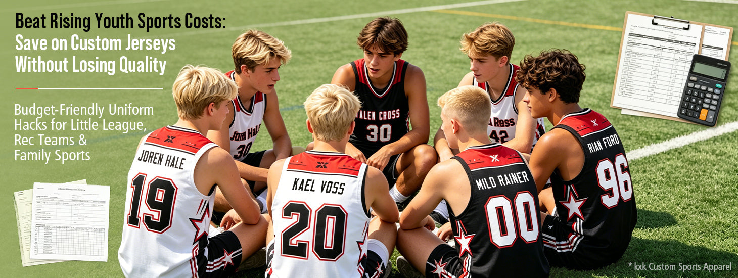

Youth Sports Are Getting More Expensive: How Teams Save Money on Affordable Custom Jerseys Without Sacrificing Quality
June 24, 2026 4 min read
As youth sports expenses continue to rise, teams are looking for ways to reduce uniform costs without sacrificing quality. This guide explains how to choose affordable custom jerseys, and save money through smarter ordering strategies. Discover how factory-direct pricing, professional design support, and reliable production help teams get better value from their uniforms.
Recent Articles
- Back-to-School Sports Guide: How to Prepare Your Team with Custom Jerseys Before the Fall Season
- How to Design Your Logo: 7 Logo Types Explained (and Which One Actually Works on Custom Jerseys)
- From Concept to Custom Jersey: How Designers Turn Your Vision Into Reality
- Youth Sports Are Getting More Expensive: How Teams Save Money on Affordable Custom Jerseys Without Sacrificing Quality
- AUU Basketball Season 2026: The Complete Jersey & Team Kit Checklist
Top Searches
 Ice Cream
Trending Now